
Pattern exploration: Making AI an equal partner in mobile interface
What if your AI companion wasn’t just hidden behind a button or tab on mobile anymore?

I was tinkering with Bloom, a little play project I started during my break from work.
The concept:
A mobile app that empowers users to unpack and track their blood test results, offering recommendations and support through conversations with an AI companion.
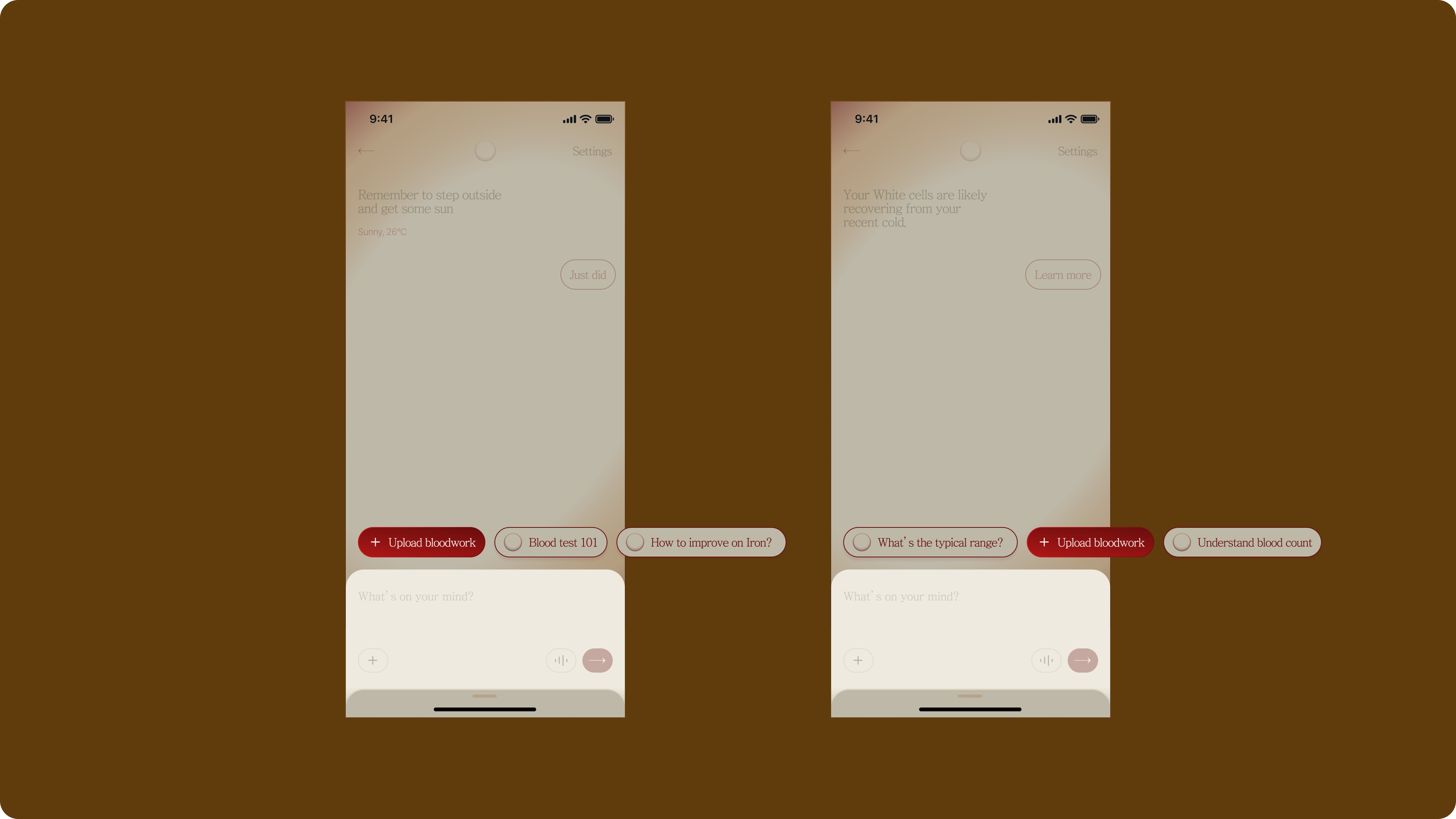
Here’s a quick impression of Bloom:
—
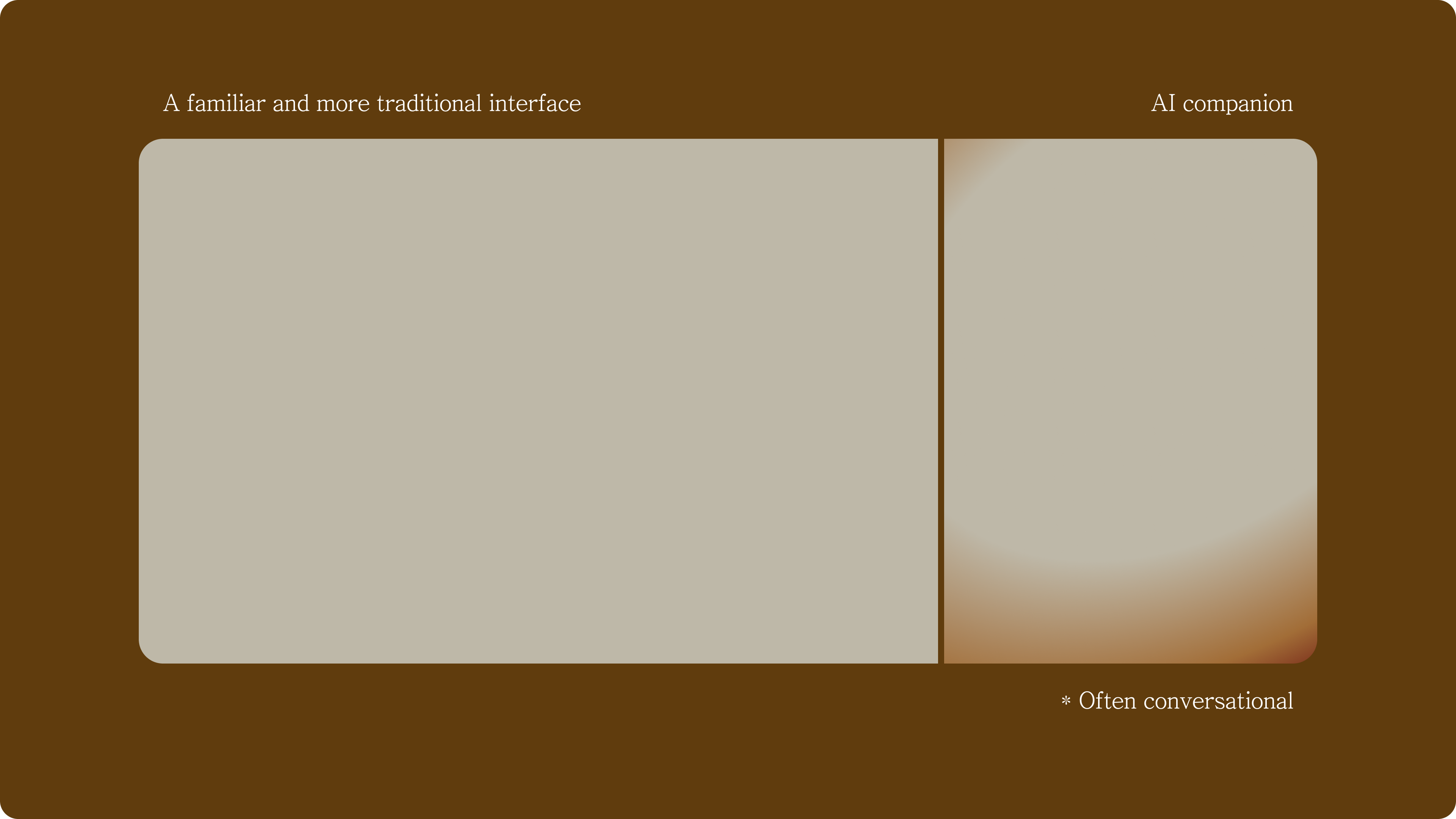
Split screen: A pattern on the rise
During day 2 of my exploration, I stumbled upon a talk on software 3.0 by Andrej Karpathy that made me pause when making breakfast.
While the talk centered on large language models (LLMs), what really struck me was a growing trend: desktop apps and software adopting a dual screen state—a traditional interface paired with an AI counterpart, often in a conversational form.
Let’s call it the “Split Screen” pattern.
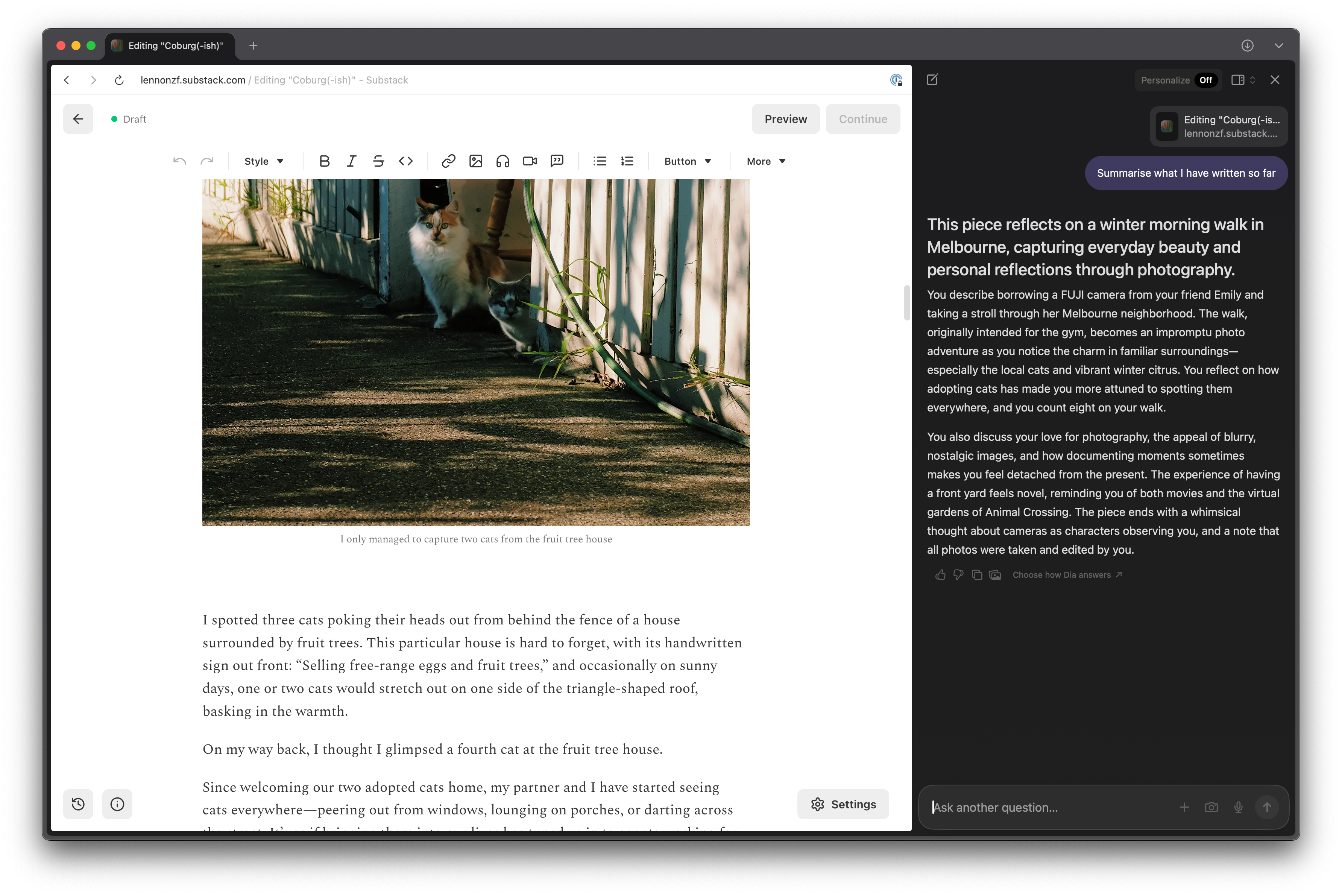
Although the pattern isn’t new, it’s only in the past few weeks, while trialing Dia (an AI-first web browser from The Browser Company, makers of Arc), that I’ve truly felt its potential firsthand.
As a pretty surface-level user of Dia (for now), what keeps me coming back isn’t anything flashy:
It’s simply the convenience of not having to switch between the window I’m working in (Notion, browser, etc.) and ChatGPT or Claude.
Plus, Dia moves with me and always knows the full context inside the tab—especially handy when I’m writing something, like this article.
Their article on the strategy behind Dia’s design was also an excellent read. The “10am on a Tuesday Morning” philosophy for a frictionless browser-switching experience really won me over.
—
Existing mobile translations
There are a few ways the Split Screen pattern has been adapted for mobile screens. Two popular approaches come to mind:
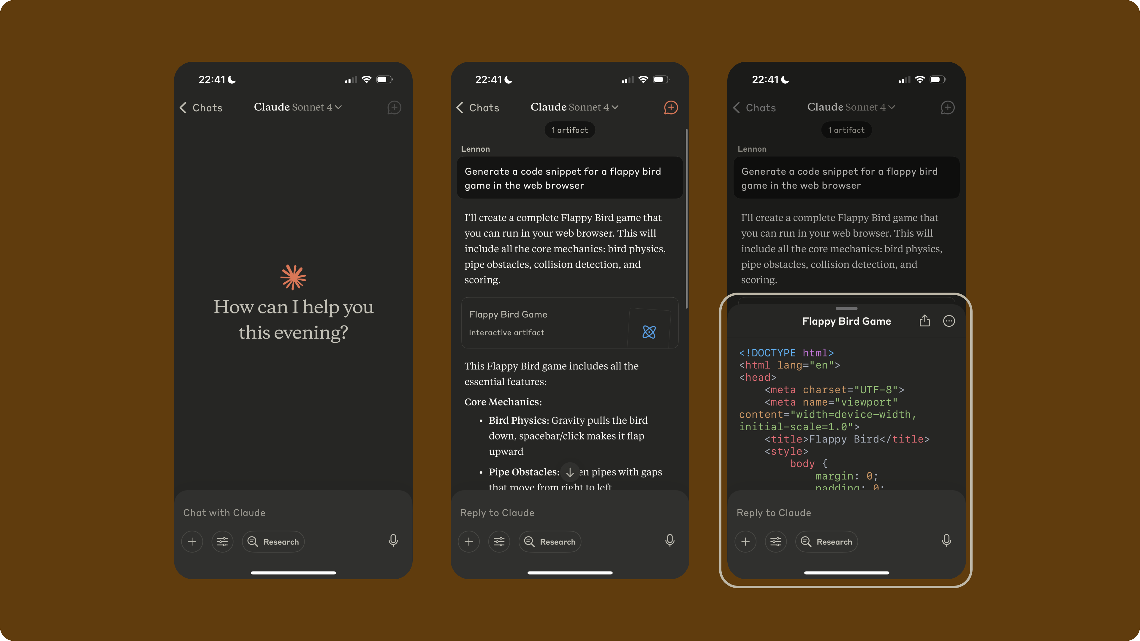
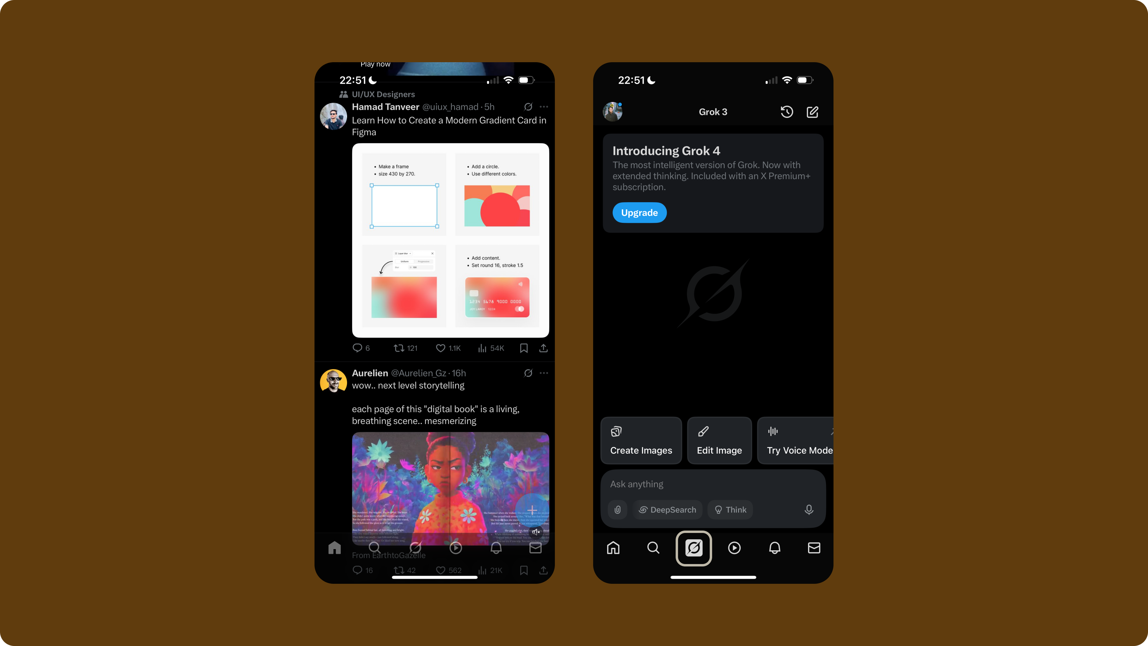
1/ Conversation-first interface
Here, the conversational AI is front and center. When a user generates or requests something specific (an artefact), a Canvas or panel pops up to display or edit the result.
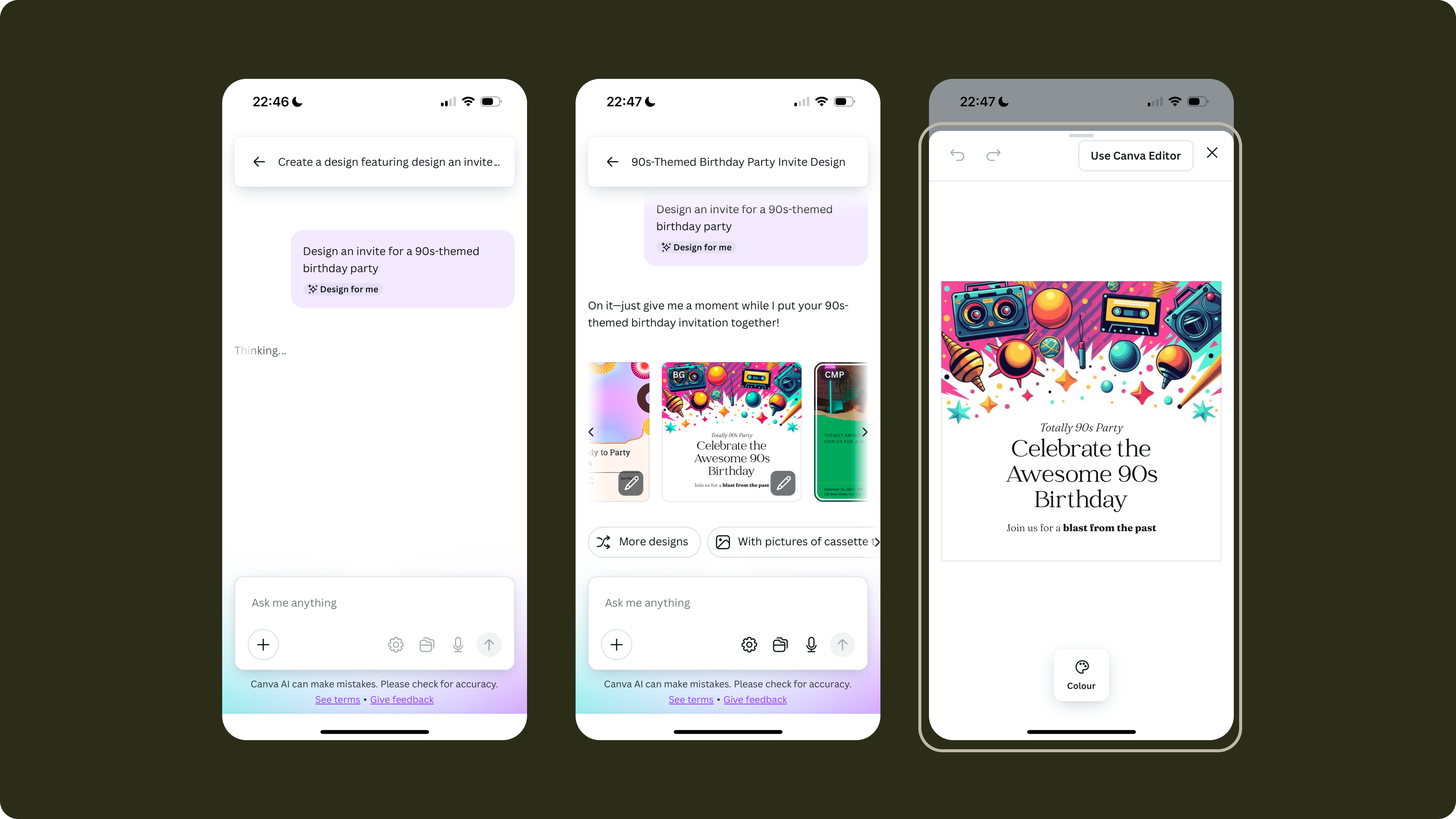
2/ Traditional UI-first interface
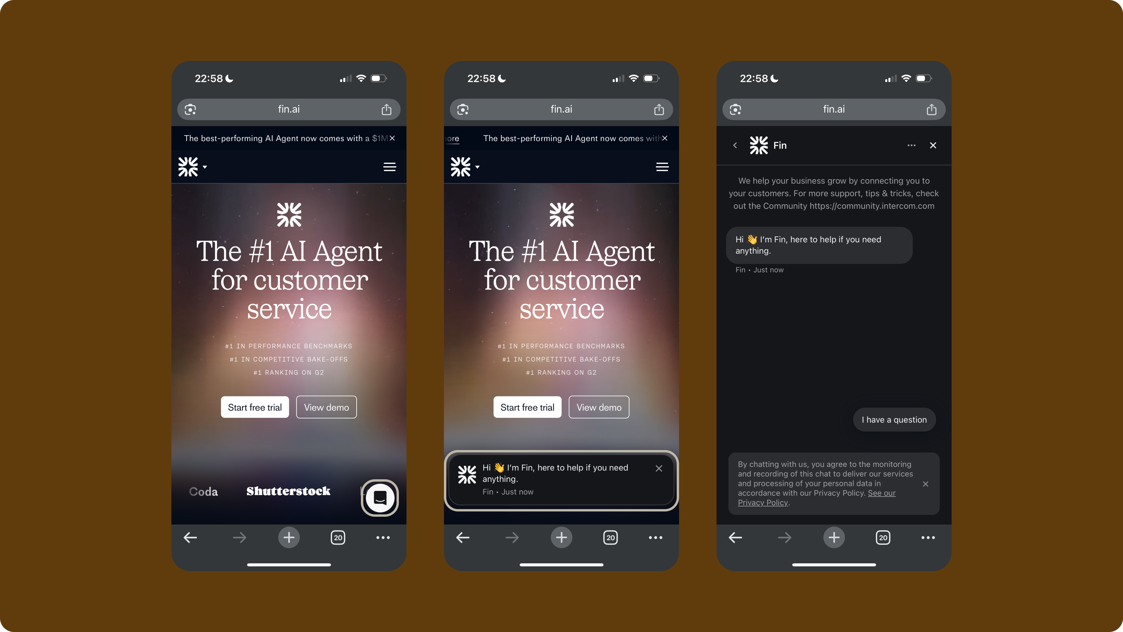
In this model, the standard app interface takes priority, and the conversational AI is tucked away—behind a tab, accessible via a floating action button (FAB), or a simple click.
Intercom is perhaps one of the pioneers
of allowing users to access a chatbot via a FAB.
—
👀 The unresolved bit…
What feels incomplete about these approaches is that neither truly treats both panels as equals. There’s always a strong bias toward one or the other.
It doesn’t feel as harmonious or balanced as what we’re starting to see more often on desktop.
—
So I wondered…
Is there a better pattern for a more balanced relationship between the two panels: traditional UI and AI companion?
Naturally, I looked to the concepts I am working on for Bloom. It’s the perfect playground, since there are indeed two major parts to represent in the UI:
A need for traditional navigation and browsing for users to go through information like Biomarkers, their archetypes, and more
A place for continuous and specific conversations with the AI companion
—
But first, an analogy
I was hungry and started picturing myself setting up dinner with a friend.
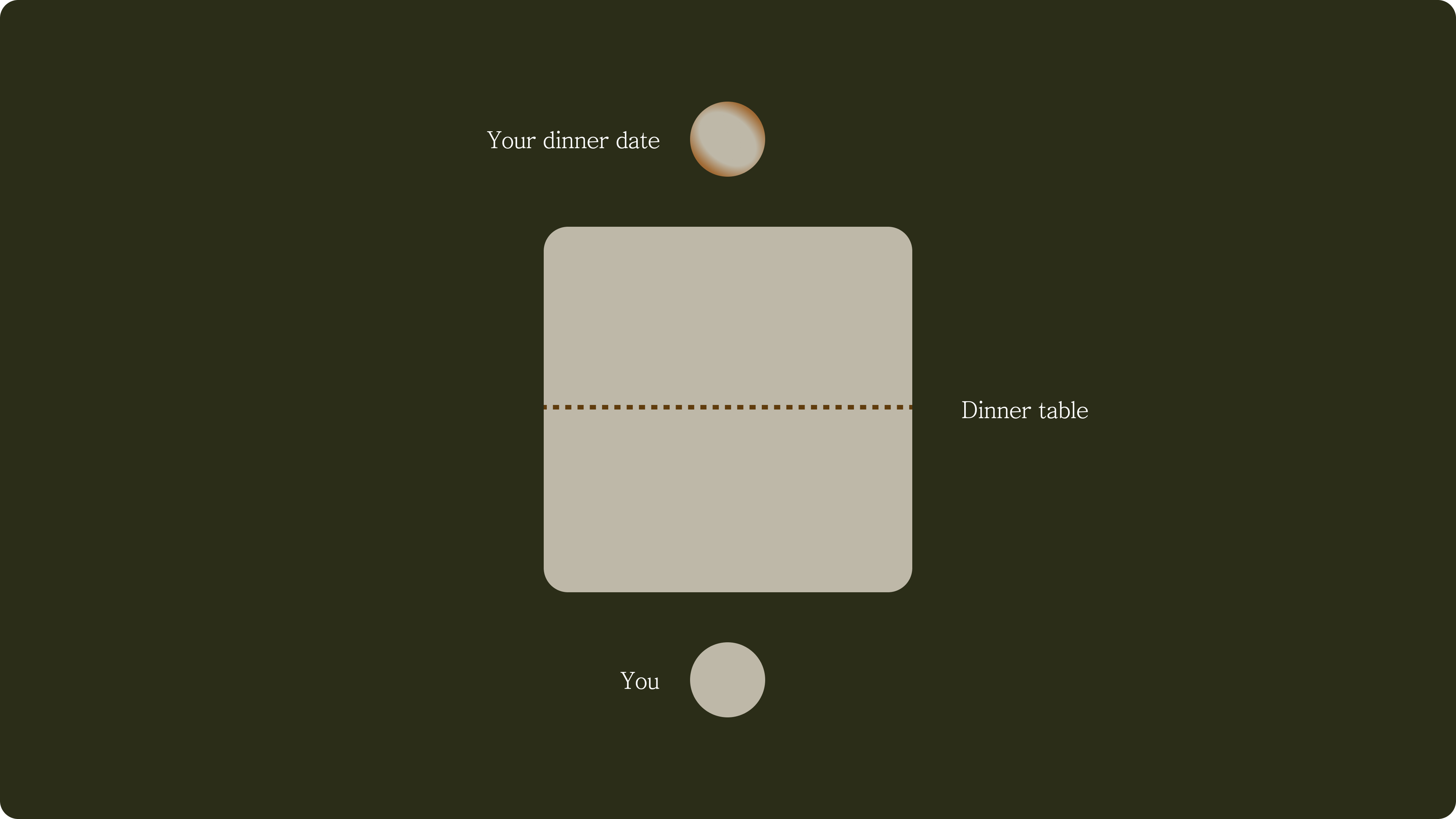
There are a few dynamics at play during a one-on-one dinner date:
1️⃣ You share a table, usually sitting across from each other (though I’m partial to sitting side by side with my partner whenever I can), and the space is divided equally—a sign of mutual respect.
2️⃣ Sometimes you want to lead the conversation, sharing stories or information, while your date responds and builds on what you’ve started.
3️⃣ Other times, you might prefer to listen and let your dinner date take the lead, replying in turn as the conversation shifts.
4️⃣ Occasionally, you’ll switch to a completely different topic.
5️⃣ A healthy dinner date swings naturally between 2️⃣ and 3️⃣. Both people can be proactive, and the exchange is genuinely two-way.
—
The pattern I explored
I set out to imagine what it would be like to invite an AI companion as my dinner date, with the mobile app interface as our shared table. After thinking through the five dynamics, here’s where I’ve landed:
Feeling a bit “huh”? Let’s retrace the steps together.
—
Retracing the steps
1️⃣ An even space
Let’s imagine the table you are sharing with your dinner date is the UI on your mobile screen. To show respect, let’s divide it evenly.
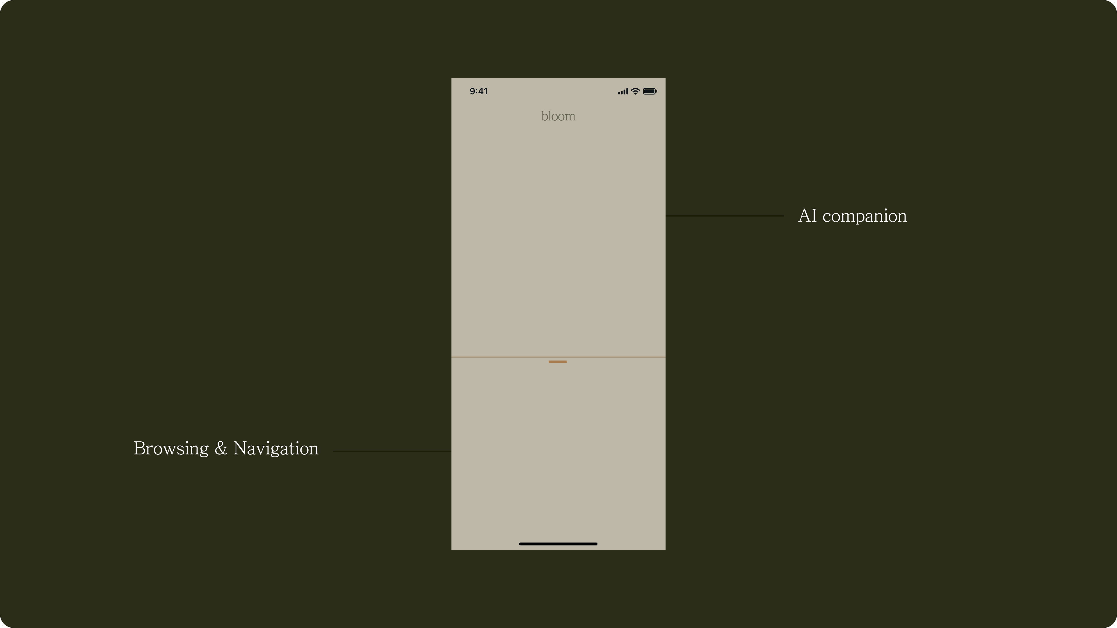
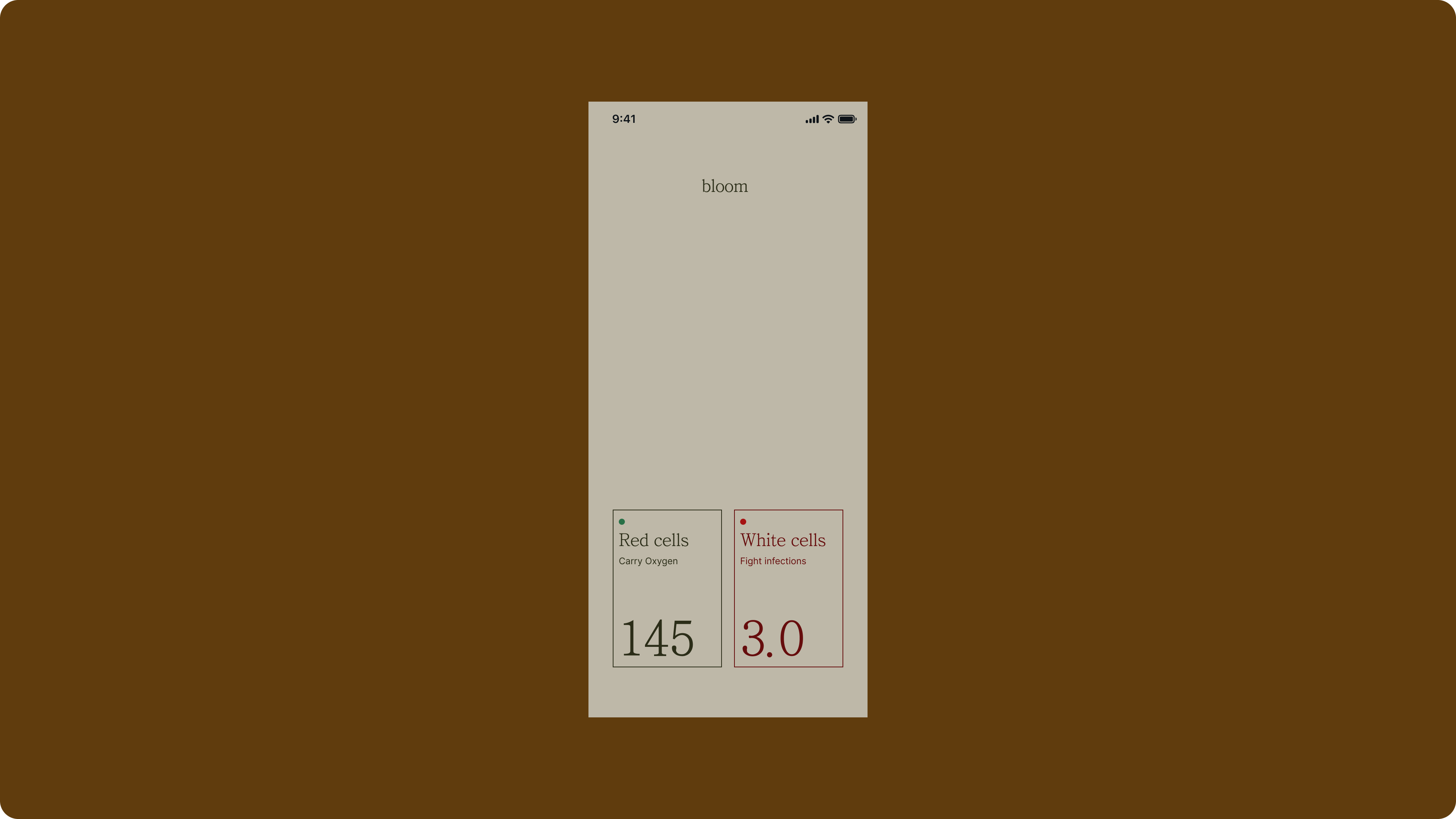
For Bloom, the traditional part of the UI should include primary actions like uploading recent blood test results, and ability to browse key information like Biomarkers, a user’s blood archetype and more.
I didn’t arrive at this structure right away. My starting point was a simple card for an individual measurement—each biomarker could have several of these, collectively offering a more complete picture.
My goals for this component were:
Clearly display the measurement’s name and its purpose
Show the user’s current value
Indicate the typical reference range, and highlight whether the user’s result falls within or outside that range
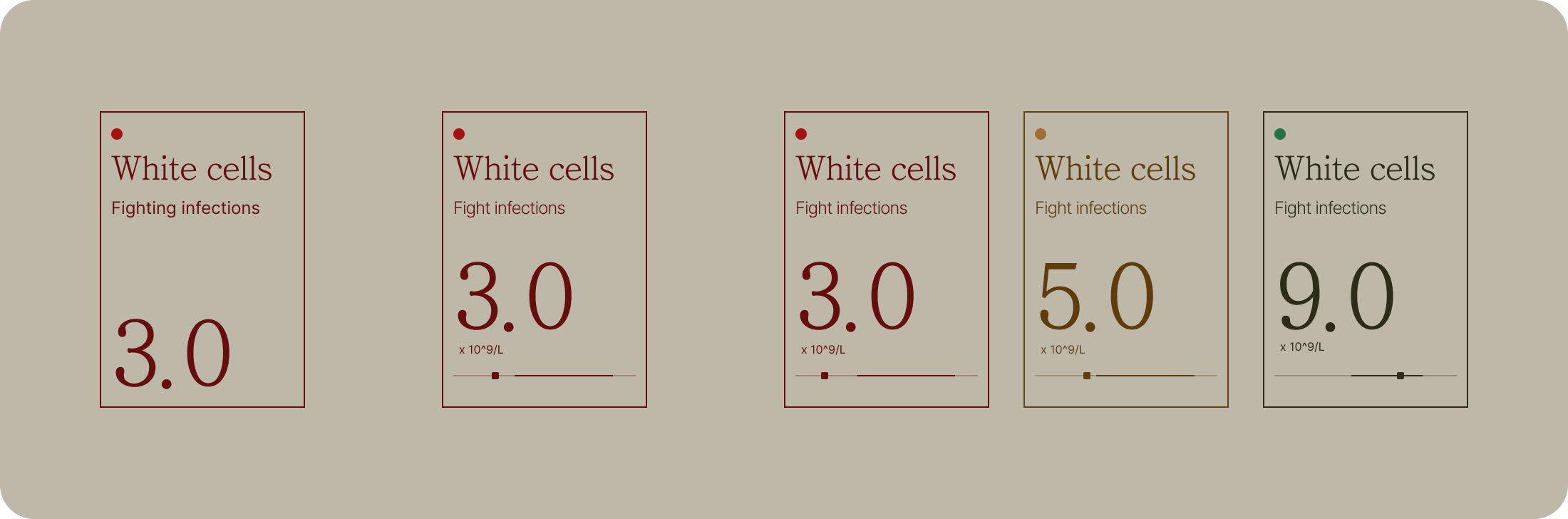
I placed these cards near the bottom of the screen. This placement felt easier and more comfortable for people to interact with the most important information without having to stretch their thumbs or adjust their grip.
To be honest, I wasn’t sure how to best use the top portion of the screen. My first instinct was to just drop a conversational interface up there, but it felt out of place.
—
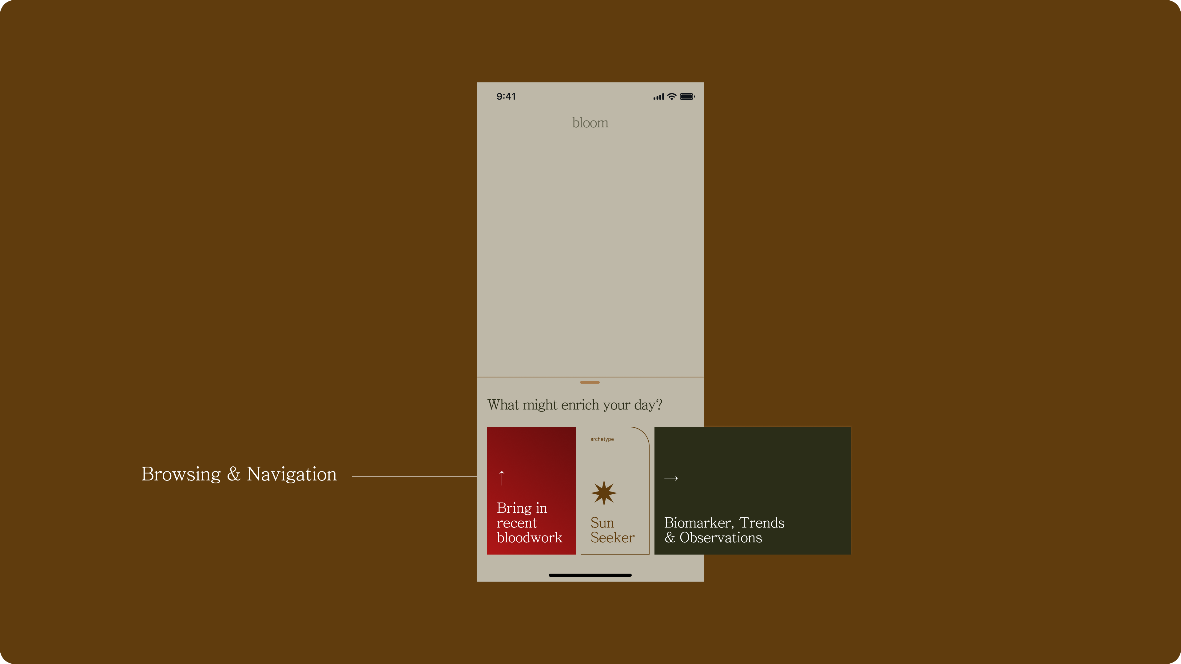
2️⃣ You lead the way
By focusing on the bottom part of the interface, where users can proactively navigate or select what they want to explore, it feels as though the users are taking the lead in the conversation, much like steering the topics during a dinner with a friend.
For example, a user can dive into Biomarkers and assess an individual measurement:
In any good conversation, you expect a response or at least a sign that the other person is engaged and listening. With the interface split so evenly, though, there’s less space to provide additional context or supporting details, unless users scroll, which isn’t always obvious or desirable.
That led me to the core of my concept:
The AI companion should move in sync with the user’s actions, offering just enough information at the right moment, rather than overwhelming the interface or demanding attention.
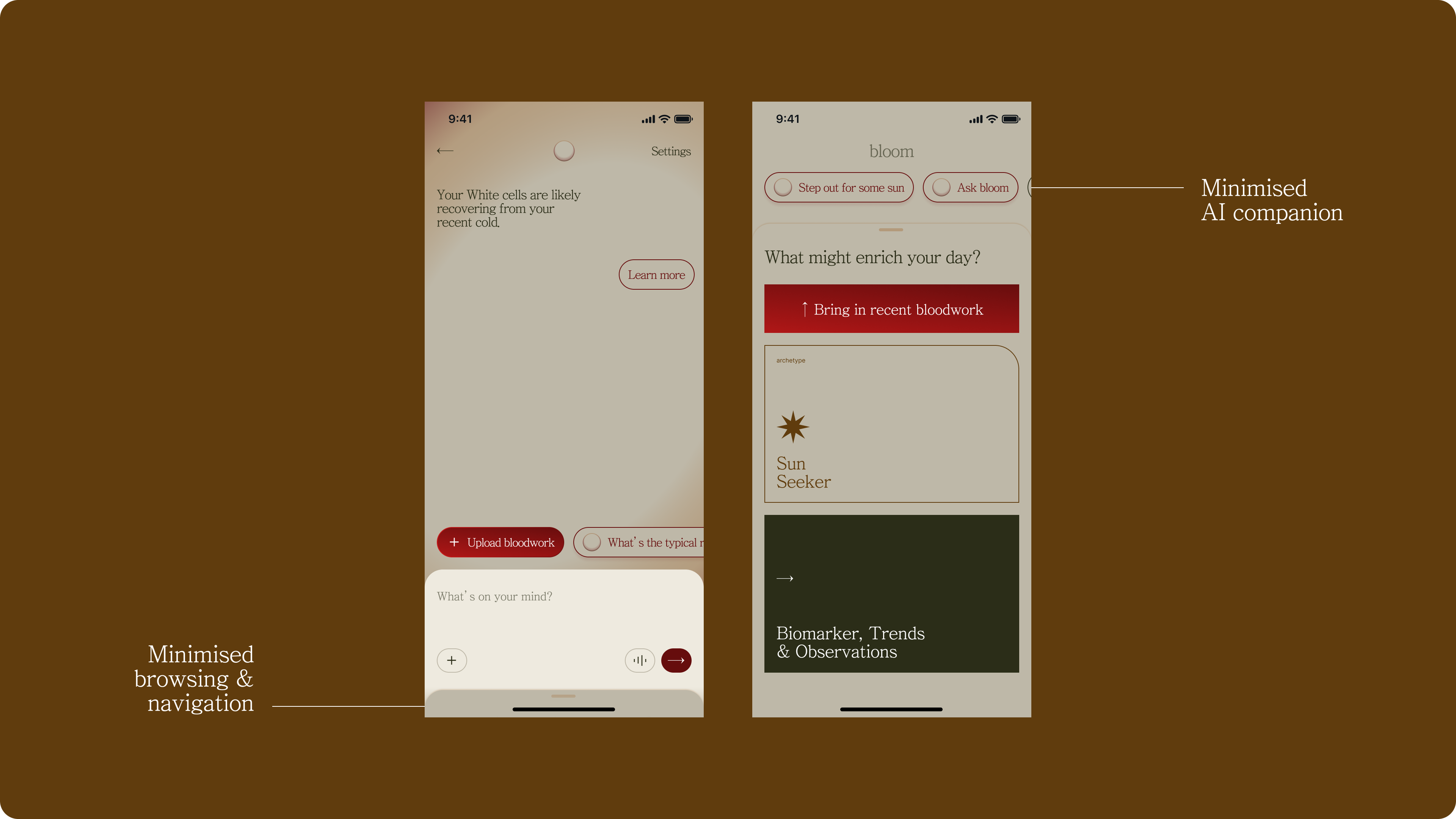
In practice, this means that as users dig deeper into Biomarkers, the AI companion dynamically updates its insights and suggestions, staying contextually relevant to whatever the user is currently exploring.
An orb
You might notice I chose an orb to represent the AI companion, partly because it feels approachable and open-ended, and mainly just for the fun of it.

—
3️⃣ Follow the lead of your AI companion
Of course, there are moments when a response from your dinner date really piques your curiosity, and you want to dig a little deeper, for example, asking follow-up questions or exploring the topic further.
In these moments, your attention centers on that one topic, and the interaction shifts into a deeper, more focused back-and-forth. That’s when it makes sense to transition users into a fully immersive chat interface, allowing for richer exploration and dialogue.
—
4️⃣ Change topics
While simplicity is always my goal, I also believe in building in a reasonable buffer for when the algorithm can’t quite predict the user’s needs. It’s like a small pool of topic possibilities.
That’s why, alongside the orb representing the AI’s best guess, I added a row of pills to suggest a few alternative actions or next steps. This offers users more flexibility without overwhelming the interface, ensuring they always have relevant options at their fingertips.
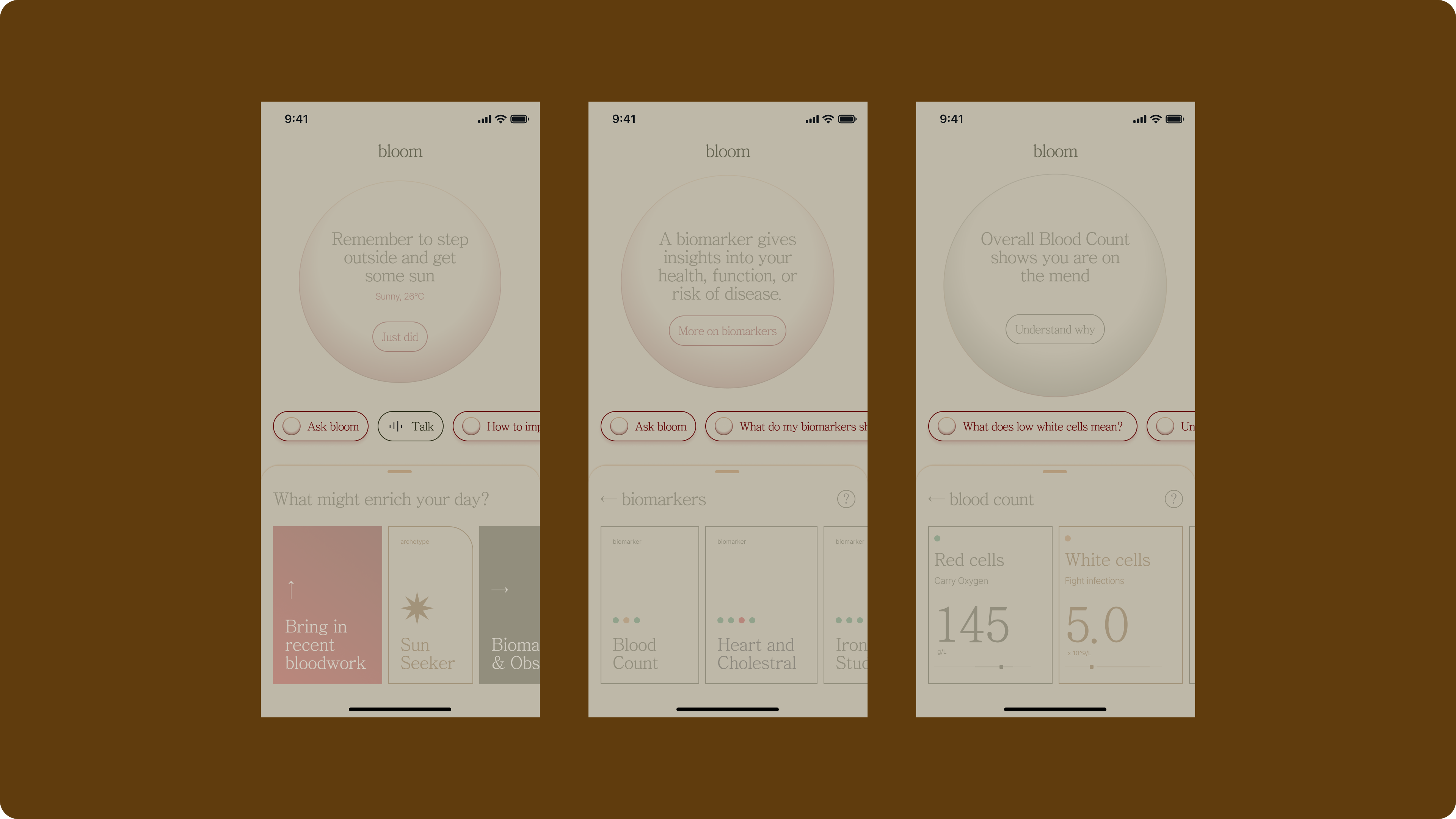
These pills should also adapt dynamically to the user’s current context, whether they’re browsing, navigating, or engaged in a chat.
This contextual flexibility ensures that suggested actions or topics always feel relevant and helpful, no matter where the user is in their journey.
—
5️⃣ Push and pull
I think we can all agree that conversations are inherently dynamic and often unpredictable, with topics shifting and evolving as they unfold. That’s why it felt absolutely essential to design the interface so users can seamlessly switch between different threads or areas of focus at any moment.
⬆️ Pull down for chat mode
Whenever a user pulls down, they enter an immersive chat experience. The same transition applies if they interact with the button inside the orb or tap on any of the suggested pills on the screen.
⬇️ Push up for browsing and navigation mode
Similarly, when a user pushes up the bottom panel, they’re shifting their focus back to browsing and navigation—prioritising exploration and information over conversation.
One thing I found interesting while experimenting was changing the main action, “Bring in recent bloodwork,” from a tile to a button. This small shift made the component feel more flexible and adaptable, opening up new possibilities for fitting it into different container sizes or layouts.
There’s plenty of opportunity to make the fully expanded browsing and navigation panel even richer—by fitting in more information and surfacing deeper context with each interaction or click.
Minimised, not silenced
Again, like any good conversation, the party that’s not leading the conversation should not be entirely silenced. Therefore, they would still have a small space for users to switch, push and pull at any time.
—
Bringing it all together
So let me walk you through it again, now that all the pieces are in place and working together as a cohesive concept.
Wrap for now
I know this pattern is far from polished or complete, but I’m happy to pause here—content with where this exploration has landed and ready to step away for a bit, soak up some sun, and take a few photos during my break.
One big question that keeps coming up for me is around searching and retrieving, which is where my journey started at Canva:
How might we make it easy for users to search for and jump back to a specific topic or revisit a particular moment in time from their conversations?
How might we enable conversations to branch off from an original thread, helping users create traceability and follow the evolution of their discussions?
—
🎈 It’s nice to just play!
It’s been incredibly freeing to explore this pattern without the usual design system constraints or established product UX boundaries I’ve worked within for a few years now.
I’m looking forward to bringing aspects of this pattern back to work once my break is over.
—
🙇🏻♂️ Thank you and I’d love to hear from you
If you made it to the end, thank you for sticking with me. In many ways, this was a selfish exercise—a chance to capture a pattern I’m fascinated by and some thoughts that came up along the way.
I’m sure there are plenty of designers out there who are wrestling with similar challenges or have already built something along these lines.
If that’s you, I’d love to hear your thoughts—whether you found resonance with this approach or have research that points in a different direction.
—